Why we love it
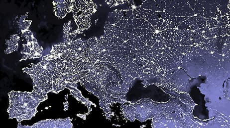
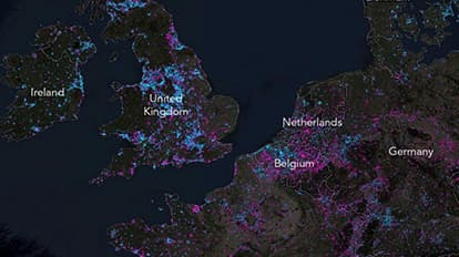
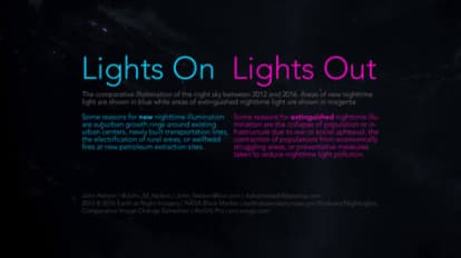
What if you could distill human movement, ambition, and violence on our planet into one single picture? This story map accomplishes that. We love how it directly compares Earth at Night imagery from 2012 and 2016 to show new or extinguished nighttime illumination. We see an illustration of nighttime light’s dichotomous nature, its ability to reveal progress or tragedy. Notably, the map shows the light from recent electrification in rural northern India and, in contrast, the darkness brought on by cataclysmic civil war in Syria.
Why it works
Maps with a single binary theme, such as more or less, are understood easily and don’t require legends or other complex explanations. Using the Firefly aesthetic, this map maintains the sense of lights flickering on or off. The effect is actually a derived mathematical result of varying input values arranged in a raster grid. Desaturated imagery allows the data to jump off the screen, captures a sense of nighttime realism, and provides context without the need for many basemap labels.
Important steps
Download NASA map
Georeference and perform a minus function
Represent nighttime brightness with colour
Add background and create colourised text title
Create an immersive experience
Requirements
Data
Analysis
Time
Tips and tricks
Consider accessible colours
Don’t map everything
Don’t go with traditional legends
Resources
Map Author
John Nelson
I have way too much fun looking for ways to understand and visually present data, engage others, and write about it. Otherwise, I’m chasing around toddlers and wrangling chickens. Life is good.