Why we love it
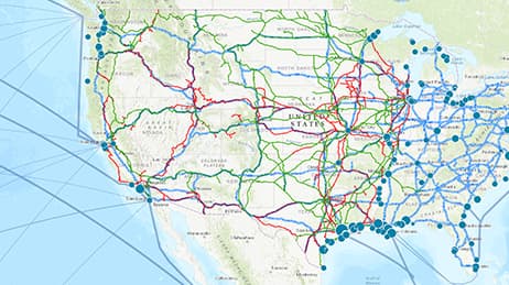
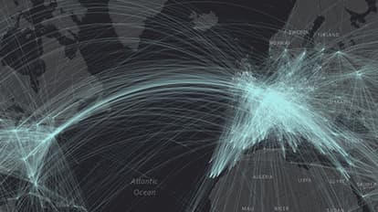
You’ve heard of art for art’s sake. We love this map because it is data for art’s sake—the growing cartographic practice of data art. This kind of map creates its own aesthetic through patterns made by data. In this case, the map shows all known connections between origin and destination airports across the globe, a total of 58,000 routes on one map. A single, bright colour atop a dark, simple basemap provides high contrast and immediate visual impact.
Why it works
This map uses high contrast and a limited colour palette. To achieve harmony, there is artful interplay between background and foreground. The design is dramatic, showing the dataset and letting the patterns speak for themselves. Using very high transparency on individual symbols (98%) shows density of routes in congested areas and avoids a jumbled mess of lines. Projection is also important and here, Web Mercator transforms essentially straight flight paths into beautiful curves.
Important steps
Create a simple spreadsheet
Run the XY-to-Line tool
Symbolise the lines
Publish
Requirements
Data and software
Analysis
Time
Tips and tricks
Look at the raw data
Do not clutter your data
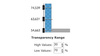
Determine the transparency
Resources
Map Author
Ken Field
Professional cartonerd, amateur drummer and snowboarder. Lifetime encourager of cartographic quality not quantity. Map with the times while building on the past.