Why we love it
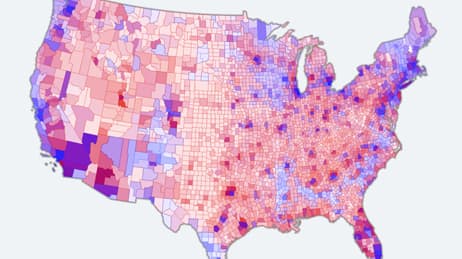
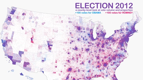
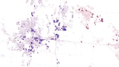
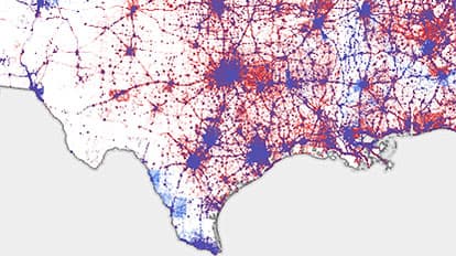
While many maps show the outcome of the 2016 US presidential election, this one illustrates how the votes were distributed across the country. We love how this map employs a unique approach in dot density mapping - each dot represents a single vote from the 130 million total votes. It is a dasymetric map, which means instead of dots filling collection areas uniformly, they are reallocated to more representative areas. In this case, the dots are constrained to areas where people live.
Why it works
Not every vote on this map is meant to be discernable. To ensure that votes don't obscure one another, each dot is transparent. This map works because, collectively, the dots coalesce into a meaningful picture of where there was uniform support. Intense blue indicates votes for Hillary Clinton, and intense red indicates votes for Donald Trump. Areas with mixed outcomes are comprised of dots that coalesce visually into varying shades of purple.
Important steps
Generalise dataset, convert to polygons
Working with datasets
Move election results to derived polygons
Create symbols for final polygons
Requirements
Data & software
Analysis
Time
Tips and tricks
Do not imply precision
Use transparent symbols
Resources
Map Author
Kenneth Field
Kenneth Field is a professional carto-nerd, amateur drummer, and snowboarder. He's also a high-quality, innovative, and sometimes a little crazy cartographer of modern maps.