Why we love it
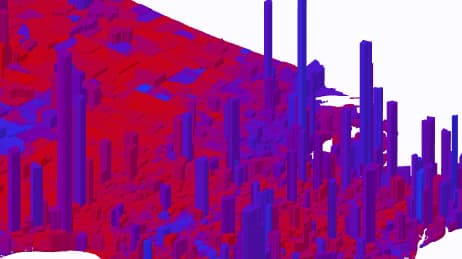
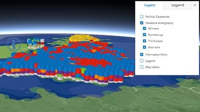
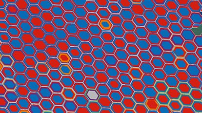
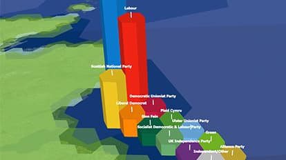
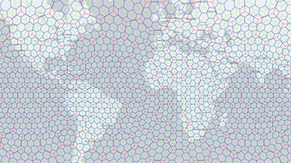
We love this map because it takes a cartogram and adds the third dimension for an eye-catching, immersive effect. This 3D hexagonal cartogram imagines a new way to visualise and record election results. It captures the results in a stratigraphy reminiscent of Giant’s Causeway, a geological marvel of interlocking basalt columns in Northern Ireland. The colours of different political parties create a layered landscape. The map legend allows us to strip away layers and explore the results.
Why it works
Rising upward, the hexagons become columns representing voter turnout, organised into four layers with the winners on top and colours defining political affiliation. A further layer of capstones shows the results as nested, proportional symbols so that, from above, the map can be viewed as a 2D summary. Progressive disclosure of labels reduces clutter and legends. Be sure to switch layers on and off and use the bookmarks to explore specific views.
Important steps
Build the grids
Build the layers
Design labels to report detailed results
Put finishing touches on layers
Requirements
Data and software
Analysis
Time
Tips and tricks
Less curve makes your map easier to read
Encode different ways to view the data
Add additional ways to see results
Use an equal area projection
Use an equal area projection
Compensate for curved surfaces
Resources
Map Author
Ken Field
Professional carto-nerd, amateur drummer and snowboarder. High quality, innovative, and sometimes a little crazy cartography in modern maps.