Why we love it
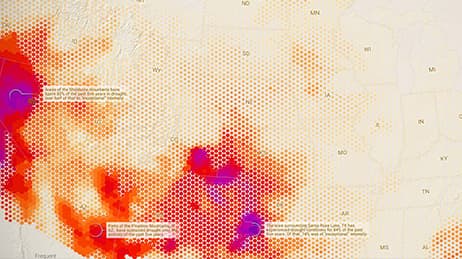
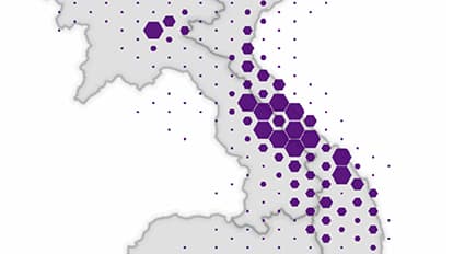
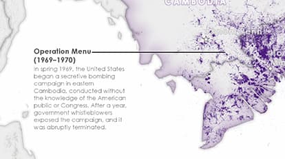
In a gripping way, this map of US bombings in the Vietnam War represents more than a million data points and makes the information instantly understandable. It gives us insights into the scale of modern warfare. Each mission is plotted as a simple point to show transportation networks and cities that were targets for US bombs. The map evokes strong emotions by identifying the hardest hit regions in Vietnam—some that endured more than 50,000 bombing missions. We also see significant and sustained bombing in unexpected places, including secretive campaigns across the border in Cambodia.
Why it works
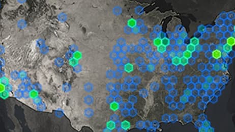
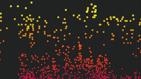
This map meets a number of challenges to detail the bombing missions of a controversial war. It works by using three complementary graphics. The main map shows one dot per mission. The proportional hexbin map aggregates that data into a larger spatial pattern. And, the bar chart shows the variation in bombing intensity over time. The use of a single colour on muted greys is as bold as it is effective and serves to place the data front and center. The carefully curated text callouts help contextualise and explain key parts of this complex story.
Important steps
Create a proportional hexbin map
Make a time series and label the cities
Provide spatial context while focusing on data
Highlight dense overlap and fade other points
Requirements
Data and software
Analysis
Time
Tips and tricks
One map won’t tell the story
Use negative space for titles and text
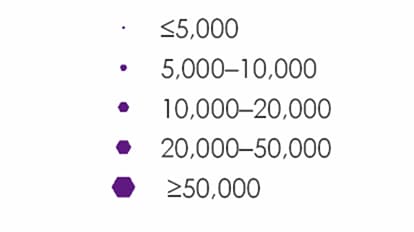
Custom legends highlight details
Map Author
Cooper Thomas
A cartographer for Esri Story Maps, a displaced Oregonian, a forager of cultural sustenance, a fair-weather motorcyclist, and a onetime expert on Kyrgyz supermarkets.