Why we love it
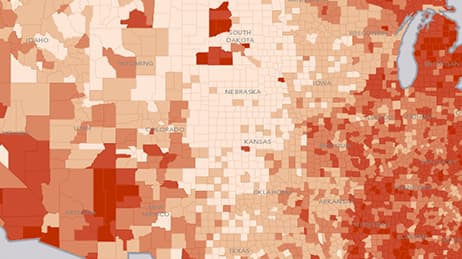
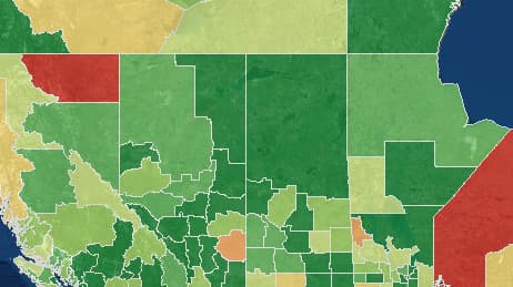
We love how colour and 3D shading work together to tell the story of US population changes from 2000 to 2010. Declining counties show up in red and shrink into the map. Growing counties pop in green and literally burst from the screen. As a bonus, you can zoom into a city to reveal more spatial details and discover changes in a particular neighborhood.
Why it works
What really makes this map useful (and smart) is the 3D shading compares nearby places using relative height. 3D especially showcases meaningful and even subtle differences within each colour. For example, red simply tells us places are shrinking in population, but shading gives us relative-depth cues to indicate wide differences in losses within that category.
Important steps
Select time period data
Use diverging colour scheme
Evaluate and publish your map
Requirements
Data and software
Analysis
Time
Tips and tricks
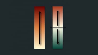
Emphasise with colour sequence
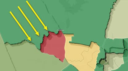
Place light source in upper left
Resources
Map Author
Wesley Jones
Mapmaker, mapmaker, make me a map. I am a geographer and mapmaker. I like illustrating and writing. I also enjoy the sport of curling.