Why we love it
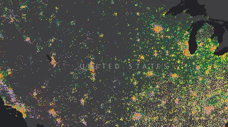
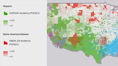
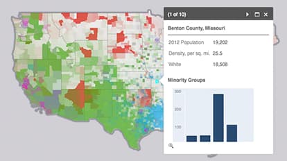
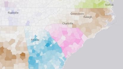
Who lives where in our country? This map helps answer that question for the US by showing the concentrations of minority populations across the nation according to US Census Bureau data. We love how colour intensity is used to represent the percentage of the population for each minority group at the county level. Here, a map tells the story of US history, regional identity and immigration.
Why it works
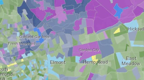
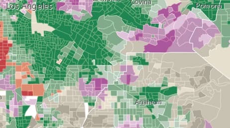
Zoom out to get an overview of the country as a whole. Zoom in to see data by state and county. The transparency of each county is varied using the magnitude of the value mapped—a technique accomplished using the new smart mapping features in ArcGIS. This map works because it answers questions and provokes curiosity that gets us asking more questions.
Important steps
Add layer
Show location as a symbol
Emphasise values
Copy the layer using different colours
Copy and configure
Save and share
Requirements
Data and software
Analysis
Time
Tips and tricks
Keep colour ramp settings the same
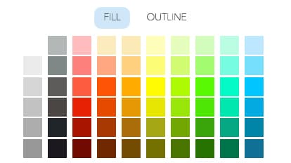
Make your map colourful
Enable layer toggling
Use neutral colours for dominant populations
Resources
Map Author
Owen Evans
Web mapper @Esri, husband/dad, ice hockey fan, floor hockey player, dog owner, guitar strummer.