Why we love it
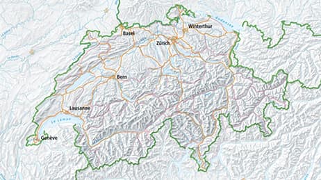
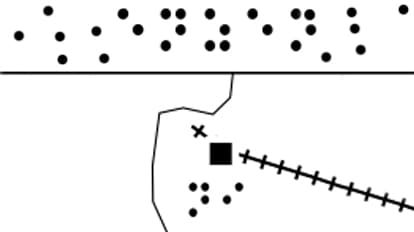
The Tactile Atlas of Switzerland gives people with visual impairment access to quality cartography. We love this approach to understanding geography. The tactile maps are made to be touched rather than seen. Raised symbols provide tangible differentiation for each feature. The atlas shares the sense of place in a new way for those unable to read traditional maps. Its methodology paves the way for the development of more tactile maps representing other areas and various themes around the globe.
Why it works
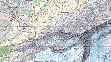
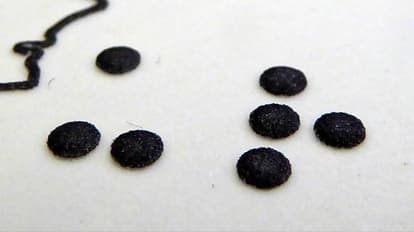
The usual rules do not apply when you want your map to be readable by fingertips rather than eyes. Symbols must be bigger and spaced wider than dictated by traditional map standards. Cartographically, it’s not advisable to portray data at a scale larger than it was captured to avoid implying more precision than is accurate. In the case of the Tactile Atlas, that is exactly what was done to ensure an adequately thin distribution of features. Too many features too close together, or with too much complexity, would be difficult to discern by touch.
Important steps
Choose large symbols the reader can touch
Reduce the complexity by spacing features out
Label sparingly using Braille
Print your map for its best function
Requirements
Data and software
Analysis
Time
Tips and tricks
Make labels simple, large and include a glossary
Make symbols large and distinct
Space symbols out
Resources
Map Author
Anna Vetter
As a cartographer at Esri Switzerland, I love to design compelling maps and visualizations and to work on exceptional projects such as the tactile maps.