Why we love It
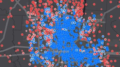
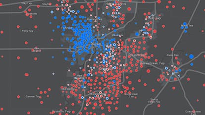
Who won the election and was it by a landslide or a thin margin? We love that this map lets you zoom into regions within each state to investigate variation hidden within final totals and see voting patterns along with close calls. A map like this would be valuable to politicians looking for battleground areas, or anyone who wants to see how people vote from city to city.
Why it works
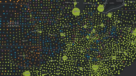
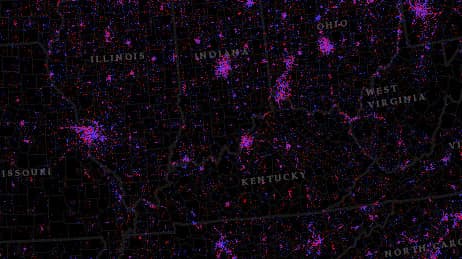
This map gives an in-depth look at the 2008 US presidential election. We’ve all seen a “red state, blue state” map, but what sets this one apart is that it shows areas where the vote was close, highlighted in white. These “on the bubble” areas are where a campaign manager might want to invest more energy.
Important steps
Make it understandable
Base symbol size on votes
Scale for best usage
Show off your map
Requirements
Data and software
Analysis
Time
Tips and tricks
Add double meaning symbols
Resources
Map Author
Jim Herries
Applied geographer, map curator for Living Atlas of the World and Urban Observatory. I work with talented people to make better maps by eliminating the noise and increasing the signal.