Why we love it
Typhoons are one of the most impressive and devastating forces of nature. They can grow to enormous sizes and cover vast distances. We love how this map makes it easy to visualise the life cycle of a typhoon (known as a hurricane in the Atlantic), and compare one storm to another to find unique details and overall patterns.
Why it works
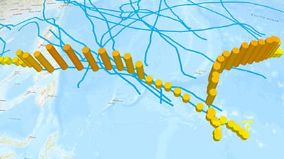
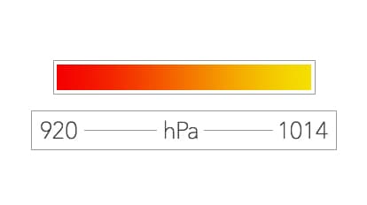
We see an intuitive and inspired use of 3D depicting the unique signature of every storm in the Western Pacific during the record-breaking typhoon season of 2005. This map works because it shows wind speed as cylinder height and barometric pressure as cylinder color along with speed of travel, total distance traveled, and storm duration.
Important steps
Sort your variables
Experiment with height
Don't clutter the map
Create time intervals with location points
Add more details
Set a time span
Requirements
Data and software
Analysis
Time
Tips and tricks
Add curves
Use a smooth colour ramp
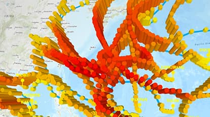
3D keeps storm tracks legible
Resources
Map Author
Nathan Shephard
Rugby playing, 3D mapping, scriptwriting, Pixzel Puzzle inventing, son of an Aussie farmer.