Why we love it
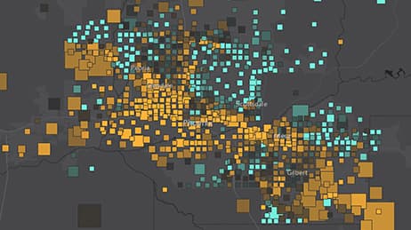
See a city through the eyes of the people who live in its neighbourhoods. We love how this map shows a neighbourhood’s proximity to quality schools. It adds a second dimension of median home value to help identify areas with affordable housing and access to quality schools. Those opportunities are represented by small, green diamond symbols. In a clear way, this map tells the interrelated stories of income and access to education. It also provides a nationwide dataset of indexes on School Proficiency, Job Proximity, Transportation Cost, Market Labor, and Median Home Value.
Why it works
This map works because it uses colour and symbol size to reveal the sometimes subtle, sometimes not so subtle, differences in neighborhoods. Red diamonds represent a low School Proficiency Index while green diamonds represent high. Diamond sizes signify Median Home Value for an area—an indication of how financially feasible it may be to move into that neighbourhood. Educational bargains are found in neighbourhoods with small, green diamonds as these are more affordable and have access to better schools. You can touch any neighbourhood to see additional HUD Opportunity indexes.
Important steps
Download data and combine into a single layer
Join layers and publish with all indexes
Use smart mapping to organize the data
Create a map to meet the user’s need
Requirements
Data and software
Analysis
Time
Tips and tricks
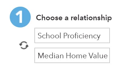
Look at the relationship between the data
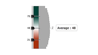
Set colour depth after determining average values
Title Required 50 characters max: Set diamond size based on home value
Resources
Map Author
Patrick O’Brien
Patrick, a lifetime geographer, has been a Solution Engineer at Esri since 2015. Undergrad at Salisbury University and graduate school at University of Maryland, College Park, Patrick has tried to map just about everything.