Why we love it
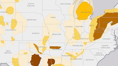
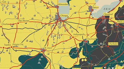
This striking, retro-style US resources map has generalized land use data to form a brightly coloured backdrop for point symbols representing mineral and energy sources. In a world of standardised mapping we love to see some mapmakers develop a different look and feel to their work.
Why it works
When a map made in 2014 reminds you of your grade school wall atlas, you know it has transcended the informational realm of most modern maps. The shapes that form the background come from the USDA CropScape database, but look hand-drawn. The massive USGS Mineral Resources data is filtered to show a reasonable amount of points that are nicely distributed using Esri’s cartographic representation.
Important steps
Get your map layers ready
Group high-level categories
Develop the symbols and distribute
Requirements
Data and software
Analysis
Time
Tips and tricks

Use a narrow colour palette
Manually create the legend
Customise further than basic choices
Resources
Map Author
Stephen Smith
I'm a self-styled GIS evangelist and cartographic connoisseur. I love working with the latest cartographic tools, using maps to send a message, and studying old styles to find inspiration.