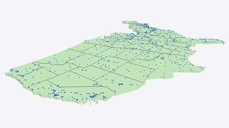
Why we love it
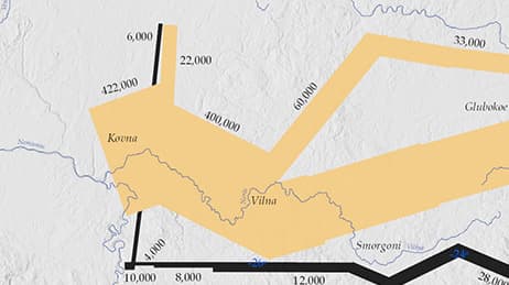
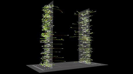
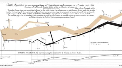
A new take on an old classic, the Minard map of Napoleon’s tragic march to Moscow is reimagined as a 3D space-time cube. We love the interactive pan, rotate, and zoom options. Time is on the vertical axis, anchored to a basemap that shows the location of cities. The slope of the line tells us how fast the troops were moving and vertical lines are periods of no movement. Troop movement dwindles downward as soldiers fall victim to injury, illness and harsh weather.
Why it works
New technology can make for new insight and give mapmakers a chance to present data in a rich new format. The Minard map showed a complex interplay of army size, location, direction, varying temperatures and a devastating loss of French troops. This interactive 3D version shows all that, plus time spent in each location so we can really see how Napoleon’s decisions turned disastrous, even deadly.
Important steps
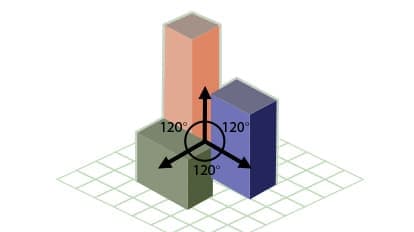
Vary the thickness to represent movement
Build from segment to segment
Reflect the maps original colours
Create different heights
Requirements
Data and software
Analysis
Time
Tips and tricks
Measure more than elevation
Create old things in new ways
Resources
Map Author
Ken Field
Professional cartonerd, amateur drummer and snowboarder. Lifetime encourager of cartographic quality not quantity. Map with the times while building on the past.