Why we love it
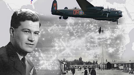
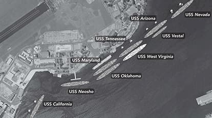
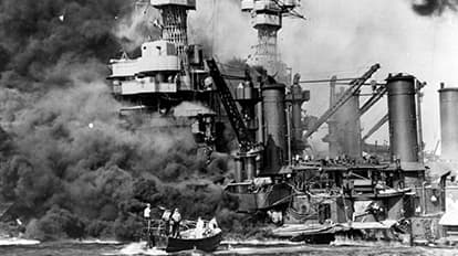
On the morning of December 7, 1941, hundreds of Japanese fighter planes attacked the American naval base at Pearl Harbor near Honolulu, killing 2,403 people and injuring 1,178 others. US President Franklin D. Roosevelt declared it to be “a date which will live in infamy.” This story map uses images, videos and maps to recreate that tragic day. We love how the map uses geographical and temporal details, across multiple battlefronts, to show a new perspective on the interconnected sequence of events.
Why it works
This story map works because it brings clarity to a complex story—one that’s made up of both calculation and chaos. Using grayscale colors for maps can be a risky choice, but here the cartography does justice to the moment in time. The map author embraces black-and-white basemaps for an old-school map aesthetic. This choice provides continuity when the story transitions from maps of the ships’ arrangement to newsreels and historic aftermath photos.
Important steps
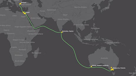
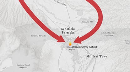
Add custom shapes for the flight path
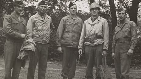
Add personal narratives
Transition with immersive sections
Black and white tells the story
Requirements
Data
Analysis
Time
Tips and tricks
Walk readers through the story
Make notes on historic photos
Tell the story with visuals
Resources
Map Author
Clare Trainor
As a cartographer, I love the stories told through compelling maps and visualizations. I was recently an intern with the Esri Story Maps Team and I now work at National Geographic helping produce maps and graphics for National Geographic Magazine.