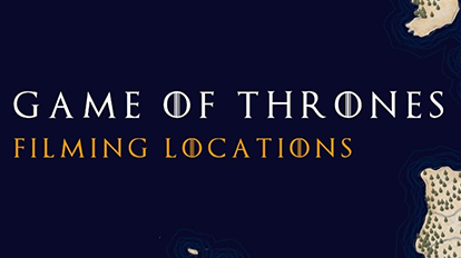
Why we love it
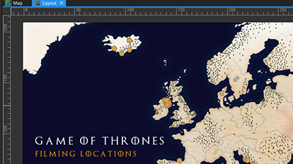
We love the watercolour effect that the mapmaker has used to really bring to life the style of this map. The bold blue makes this map particularly eye-catching and allows the detail of the land and the filming locations to distinctively stand out. We love that this map shows the wide range of filming locations that the programme has used.
Why it works
This map works so well as it embodies the Game of Thrones style, making it instantly clear from looking at it what the map represents. It demonstrates that a map can be artistic and applied to many different subject areas.
Important steps
Apply a custom style
Symbology is not just limited to the out-of-the-box styles in ArcGIS Pro. Use customs styles to take your maps to the next level. These can be created yourself or downloaded online.
Duplicating layers
Creating multiple copies of the same layer broadens the stylistic possibilities. The Watercolour style comes to life when layers using different colours are placed on top of one another and then rendered at different levels of transparency.
Choose a suitable projection
Selecting an appropriate coordinate system is crucial when creating static maps. Take some time to try a variety of options before settling on a projection that displays your cartography in the best way possible.
Requirements
Data & software
The basemap used to create this map was downloaded from John Nelson’s Tattered Map Sandwich Project file. This also contained all the styles needed to create a Game of Thrones inspired map.
Analysis
The only analysis used to create the map was the Clip tool. This was used to trim snowy polygons down to the extent of the landmasses.
Time
Most of the time spent on this map was used to play around with the custom styles to try and create an output that closely reflects the appearance of the authentic Game of Thrones map.
Tips and tricks
Style your text
Don’t limit your use of style to just the map itself. Using custom styles for fonts and labels can add further authenticity. Any custom font imported on your computer can be used in ArcGIS Pro!
Take time creating your layout
A crucial part of creating stunning static maps is configuring a layout before they are exported. Find the right extent and place any other map components to perfectly frame your cartography.
Resources
Map Author
Jess Houghton
Jess is a Technical Research Consultant at Esri UK who creates data visualisations and analytical maps using ArcGIS Pro and ArcGIS Online | Thanks to Lara Salam and Chris Alley, Esri UK who contributed to this map.