Why we love it
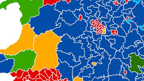
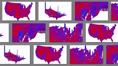
When you see election results on a flat map, you can get a distorted view. In 2D, this map of the 2012 US presidential election is mostly red as Romney voters turned out in force in many areas with low populations. When we flip the map to 3D we see the blue blocks of Obama voters rising from the map. We love this map lets you control the view to get a more realistic sense of voter patterns.
Why it works
This map uses an isometric projection to render prism heights so they are equally scaled across the 3D view. We normally view 3D in perspective, so things that are farther away appear smaller. An isometric projection preserves relative heights so you can directly compare objects in the foreground and background. This map shows the total number of votes cast with height and the percentage of votes per candidate with colour.
Important steps
Extrude your polygons
Balance your vertical scaling
Set field angle to 1
Share your 3D scene
Requirements
Data and software
Analysis
Time
Tips and tricks
Place bookmarks for quick views
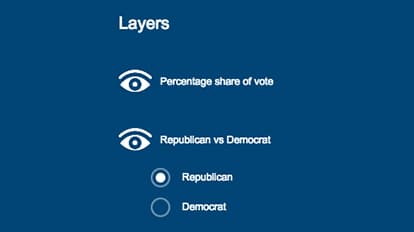
Add Group Layer for diversity
Resources
Map Author
Ken Field
Professional cartonerd, amateur drummer and snowboarder. Lifetime encourager of cartographic quality not quantity. Map with the times while building on the past.