Why we love it
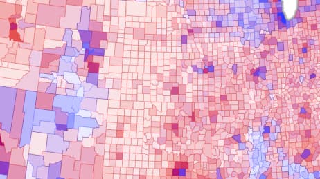
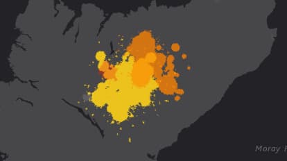
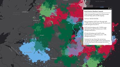
Politics can be a messy business. Most election maps show the winners without the voting nuances. We love this map because it makes a visual metaphor of the election results using artistic design inspired by Jackson Pollock. Symbology mimics Pollock’s famous paint splattering to show complexity in the 2015 UK General Election. The 13 different parties are represented by their colours and paint is applied to 650 political constituencies to create a visually arresting image.
Why it works
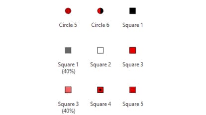
For each of the 650 constituencies, four symbols are added to the map to represent winners, runners-up, third place, and others. Symbols are offset, sized proportionally by vote number, and randomly rotated to give the sense of paint splatters. Transparency mutes all but the winner’s symbols for an overall impression of a messy mix of paint. Against a dark grey canvas, colours pop and then blend just as they do in electoral geography.
Important steps
Group by constituency
Add layers for voted category
Each category needs a symbol
Resize symbols proportionately
Publish
Requirements
Data and software
Analysis
Time
Tips and tricks
Customise map symbols
Make your symbols pop
Reduce complexity
Resources
Map Author
Kenneth Field
Professional cartonerd, amateur drummer, and snowboarder. High quality, innovative, and sometimes a little crazy cartography in modern maps.