Why we love it
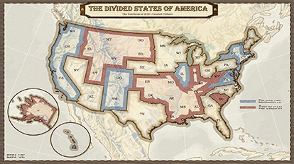
This map-based infographic is a creative display of US presidential elections of 2020. The Wild West-theme works as an eye catcher to reiterate to the public what states to pay attention to as the results will be rolling in from November 3rd onwards. Without explicitly stating it, this graphic is a satire on the progression of this election cycle. It can be said that the pandemic has led to mass casualties in America with an economic meltdown likely on the horizon. Fake news and conspiracy theories are now normalised. Presidential debates have turned into unorthodox reality tv. Political opinions have polarised and hardened. Arguably, the US has transformed into a fear-driven, uncooperative and each-for-themself type of landscape. It’s the Wild West out there!
Why it works
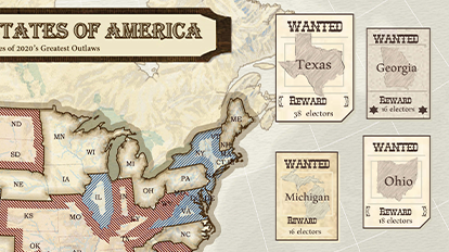
Leaning on the Western metaphor, the map consists of multiple layers of information all brought to life by flamboyant cartography. The familiar ‘blue vs. red’ colour scheme is used to indicate what states are almost certain wins for either the Democrats or the Republicans and grouped into territories. This leaves contested territories ready to be claimed, where results are harder to predict. For those with an eye to detail there are additional graphics, all cowboy-inspired, that give further back story. Wanted posters display the contested states with the highest number of electoral seats and a scoreboard bar chart has been transformed into a Trump/Biden staredown. The combination of these elements and their coherency with the map deliver the charm of this parody of an election forecast!
Tips and tricks
Add Depth
Add depth to your map. Grid lines go behind the land masses; hill shades intensify the topological characteristics; thick borders emphasise the area of interest (I.e. United States); the map sits in a frame and additional elements hover over it with different shadows.
Use a graphic editor
Continue your cartography in a graphic editor! Map design does not end after your layout has been exported into a JPEG. The map theme here was further enhanced in the Adobe suite of products by adding a customised title, legend, and credit section.
Infographics
Combine your map with infographics. This map functions an informative backdrop to a bigger narrative, told through the infographic at the bottom which in turn connects to the wanted posters. Be careful to not overload your composition with graphics by choosing the appropriate map scale.
Links & Resources
Map Author
Celine Goslinga
Passionate about data visualisation, spatial analysis and Earth observation, Celine joined the Esri UK team as Graduate GIS Consultant.


