Why we love it
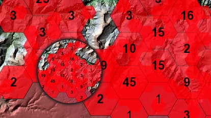
Morbid as its theme may be, this map makes great use of hexagonal binning and chromastereoscopic colour—which means it can be viewed holographically in 3D if you’re wearing special glasses. Dramatic, rich colours remind us of the power, beauty, and dangers of the Grand Canyon. As we zoom in, the map reveals more information and shows details-on-demand, encouraging us to explore.
Why it works
Inspired by the book, Over the Edge: Death in Grand Canyon, this map helps tell the fascinating and heartbreaking stories of more than 700 lives lost. The map quickly shows patterns, clusters, and isolated incidents across the national park so we can understand how and where people died. The almost abstract style and strong colours invite further inquiry.
Tips and tricks
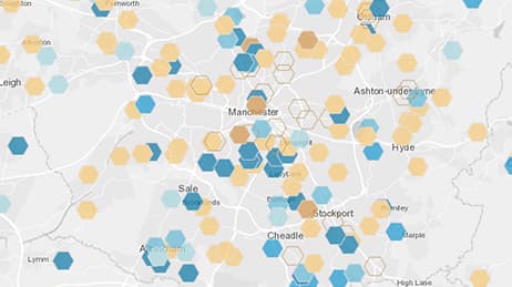
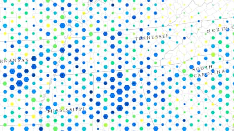
Size hexbins to the correct scale
Resources
Map Author
Ken Field
Professional cartonerd, amateur drummer and snowboarder. Lifetime encourager of cartographic quality not quantity. Map with the times while building on the past.


