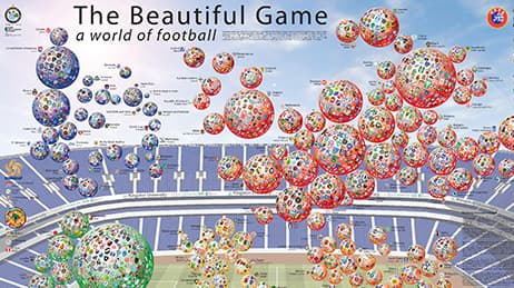
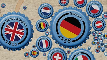
Why we love it
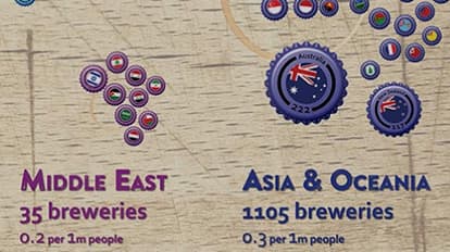
We love this map because it brings a bold aesthetic to otherwise basic point data. It was designed as a large wall hanging (17 ft or more than 5 m wide!) for a brewery tasting room. Here we see an innovative use of the Dorling cartogram approach, a technique for mapping thematic data. It allows the data to be summed up by country and mapped in an eye-catching, abstract way with beautiful symbology.
Why it works
Bottle tops are scaled as proportional symbols to show the number of breweries per country. This cartogram works because it quickly gives us a sense of the major brewing nations organized by geographical areas and positioned to mimic a world map. Minimal text provides labels and numbers. The bottle tops appear to be strewn across a table, yet are carefully illuminated with a light source from the top left.
Important steps
Geocode locations as addresses
Shape your map with manual editing
Customise bottle top symbols
Play with the layers
Requirements
Data and software
Analysis
Time
Tips and tricks
Experiment with scaling
Try new ways of processing data
Be creative
Resources
Map Author
Ken Field
Professional carto-nerd, amateur drummer and snowboarder. Lifetime encourager of cartographic quality not quantity. Map with the times while building on the past.