Why we love it
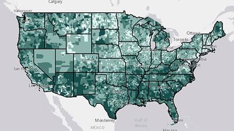
This map reveals the sobering fact, in nearly every part of American cities, there are people living in poverty. We can see the ratio of households living above and below the poverty line. We also get a clear visualisation of neighbourhoods struggling with poverty and the issues often tied to it. We love this map lets you click on each neighbourhood for more details.
Why it works
A map of ratios can be powerful. In the US overall, there are 6.2 households living above the poverty line for every household living below. This map uses green to indicate areas with a higher than normal ratio of households living above, compared to below, poverty. Orange areas show a higher than normal ratio of households living below the poverty line.
Important steps
Shade for representation
Set a standard
Save and present
Requirements
Data and software
Analysis
Time
Tips and tricks

Complement with the colour wheel
Resources
Map Author
Jim Herries
Applied geographer, map curator for Living Atlas of the World and Urban Observatory. I work with talented people to make better maps by eliminating the noise and increasing the signal.